When you’re using maps (digital or otherwise) , the quality of the underlying information is all-important. For LandRanger and Explorer digital mapping, the OS has always provided data at a resolution of 254 DPI (Dots Per Inch : with 254 DPI, one ‘dot’ equals 5 metres on the ground). This is fine for most uses, but the shortcomings of this comparatively low resolution are apparent in a number of places.
For example, when printing maps: 254 DPI is well below the resolution achievable with a good colour laser or inkjet printer, and the result is that printed maps are not as sharp and easy to read as an OS-printed original. And the current generation of tablets and phones with ‘retina-like’ displays means that screen resolution exceeds that of the data, even when just viewing at a one-to-one scale. Of course, as soon as you zoom in the problem is even more apparent, with fuzzy lines and Image compression artifacts coming into play. If you print maps to take hillwalking, this is an issue.
Ordnance Survey seem aware of the problem, and will now license their set of high resolution 660 DPI maps to third-party mapping software vendors. As I write (March 2013), there are only two sources of this mapping that I’m aware of: Anquet, and the Ordnance Survey itself with it’s new MapFinder app for iPad and iPhone (not yet tested). With Anquet, there’s a not-unreasonable extra charge of 20% over the standard res mapping.
The good news first : This gives a wonderful improvement in the quality of maps printed from Anquet. Contour lines and fine detail are much more easily read on printer output. The image mangling done by the Ordnance Survey, the software, and – finally- by the printer all combine to reduce the quality of the final printed image, so by starting with a higher resolution image, you’re almost guaranteed a better result.
However, it’s not quite as good as the raw figures would imply. Ignoring Anquet’s dubious claim that a jump from 254 to 660 DPI gives a 6.75x increase in resolution (pixel count: yes. spatial resolution: no) there are some other downsides to the new 660 DPI mapping. The standard def. mapping is sampled and filtered from higher resolution data so that the eye perceives a higher quality image than the low resolution suggests, basically using shades of grey to represent complex detail rather than on-off pixels, like this.
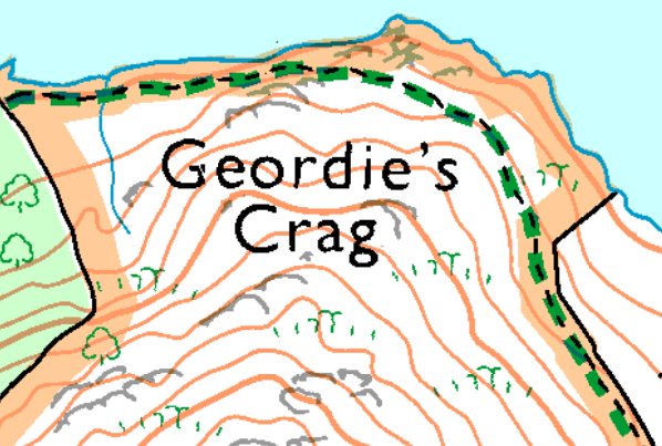
 But, the new mapping seems to not have this filtering done – probably because there just is no higher reolution data to filter down from – so detail when zoomed in looks very different. Here’s a couple of screenshots of a section of an Anquet sample map showing 254 vs 660 DPI. First off, 1:50K Explorer, standard resolution, zoomed showing a 1Km width. You’ll see the contour lines appear fuzzy when zoomed this big, but all the map detail is there.
Here’s the HD equivalent. Zoomed this much, we can see noticeable aliasing artifacts (the dreaded ‘jaggies’ on contour lines (particularly those in the lake) and the letter ‘E’. Subjectively the image is much sharper and -interestingly – the colours more vivid.
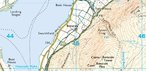
Now, here’s a section of the same area at 1:25K, standard resolution. The fuzziness of the letters when zoomed this big is noticeable.
The same area in high res is again sharper, but shows what appear to be scanning artifacts on the text, like the distorted top of the ‘d’ – meaning that the image has been scanned from a paper original, and therefore we are at the quality limit of what OS can deliver in terms of LandRanger mapping. The CRoW area ‘colourwash’ has been removed, while the boundary remains – I suspect this is a change for the latest Landranger 2012 maps, rather than related to the HD versions.
Unfortunately, the HD maps also show up a shortcoming of Anquet’s PC software : It seems there’s no filtering done when you zoom out on a map, so when using at a comfortable scale on-screen, the high-res mapping tends to look like this – HD at top, SD below: See how the HD text is difficult to read, with varying weights on vertical lines, and how the ’45’ grid line has completely disappeared. For normal screen use (unless you’re zoomed right in close) the standard resolution maps work better with Anquet because they are already filtered.

Conclusion : OS 660 DPI mapping gives a welcome boost in quality in printed maps, and I’d love to see them being available on other mapping software in the future. It seems unlikely that any higher resolution scans of Explorer or Landrager maps will ever be available. But, the higher resolution – and the scanned nature of the high-res maps – mean that mapping software needs to be able to process the images correctly for both screen and print use. If you use Anquet primarily for printing maps, buy HD maps. If you rarely print maps, don’t bother – yet. I’ll look at what OS MapFinder offers in another post shortly.